VI / Art Direction / Neon Signage / Menu Design / Teaser for Social Media
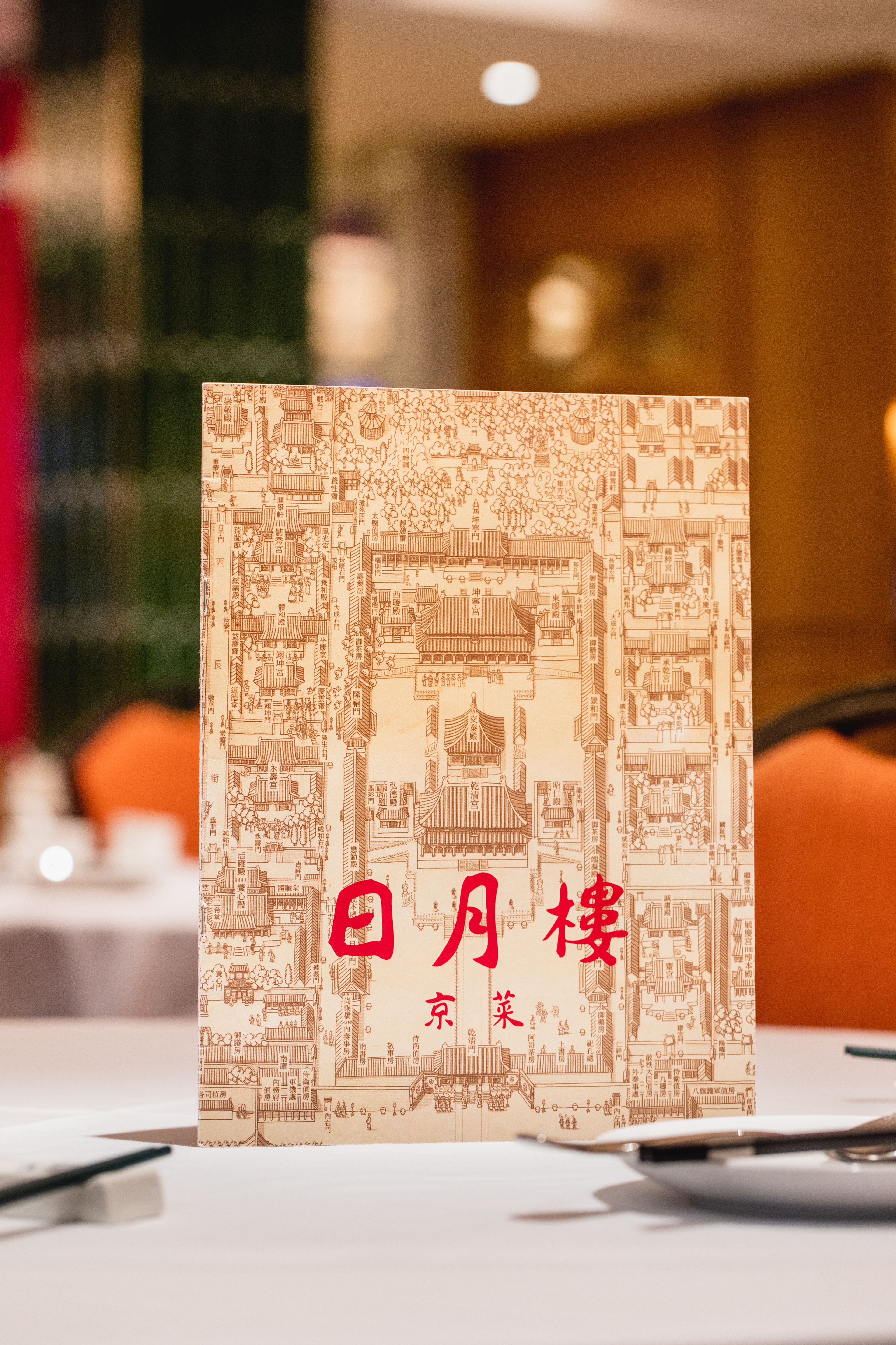
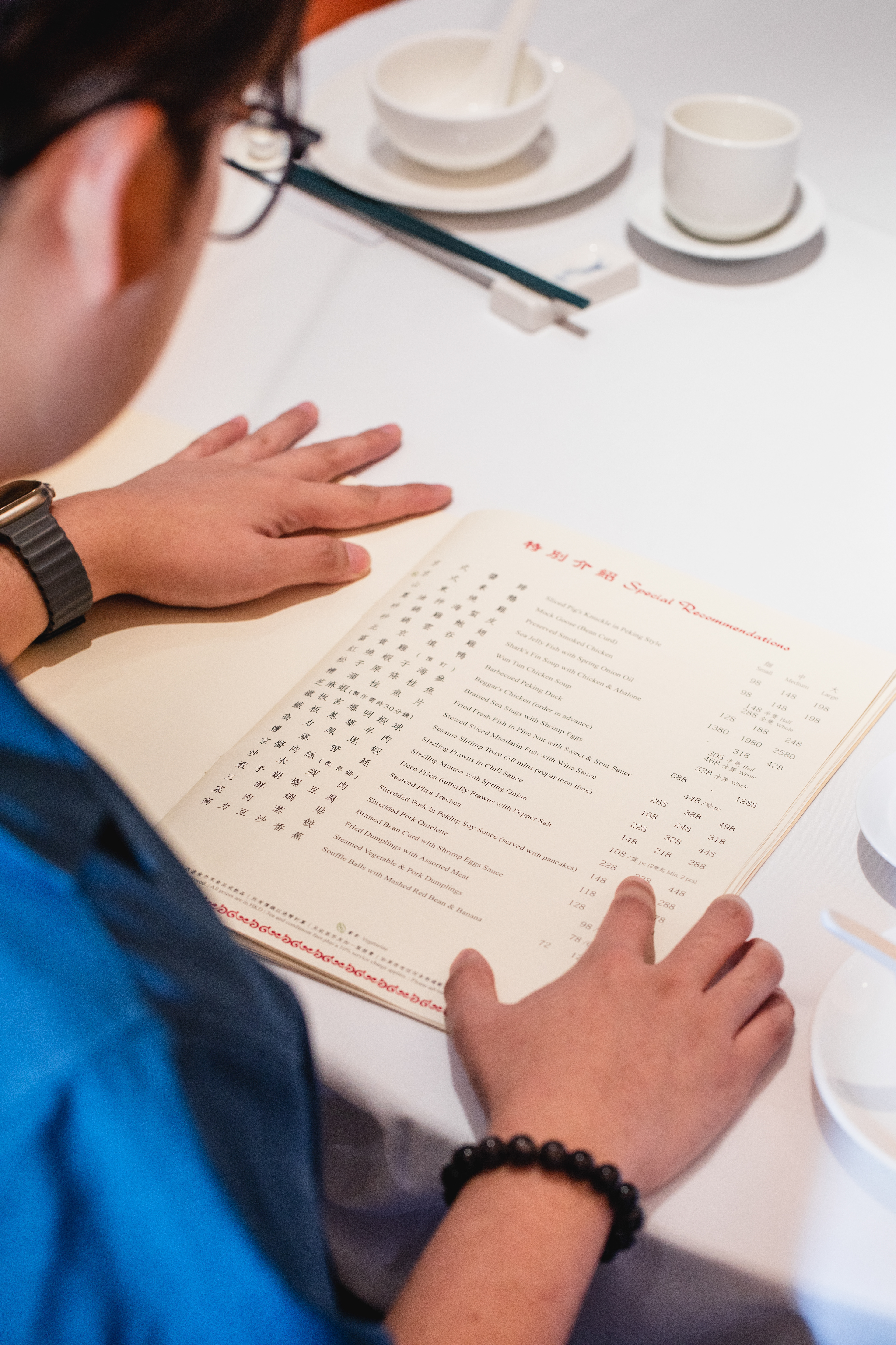
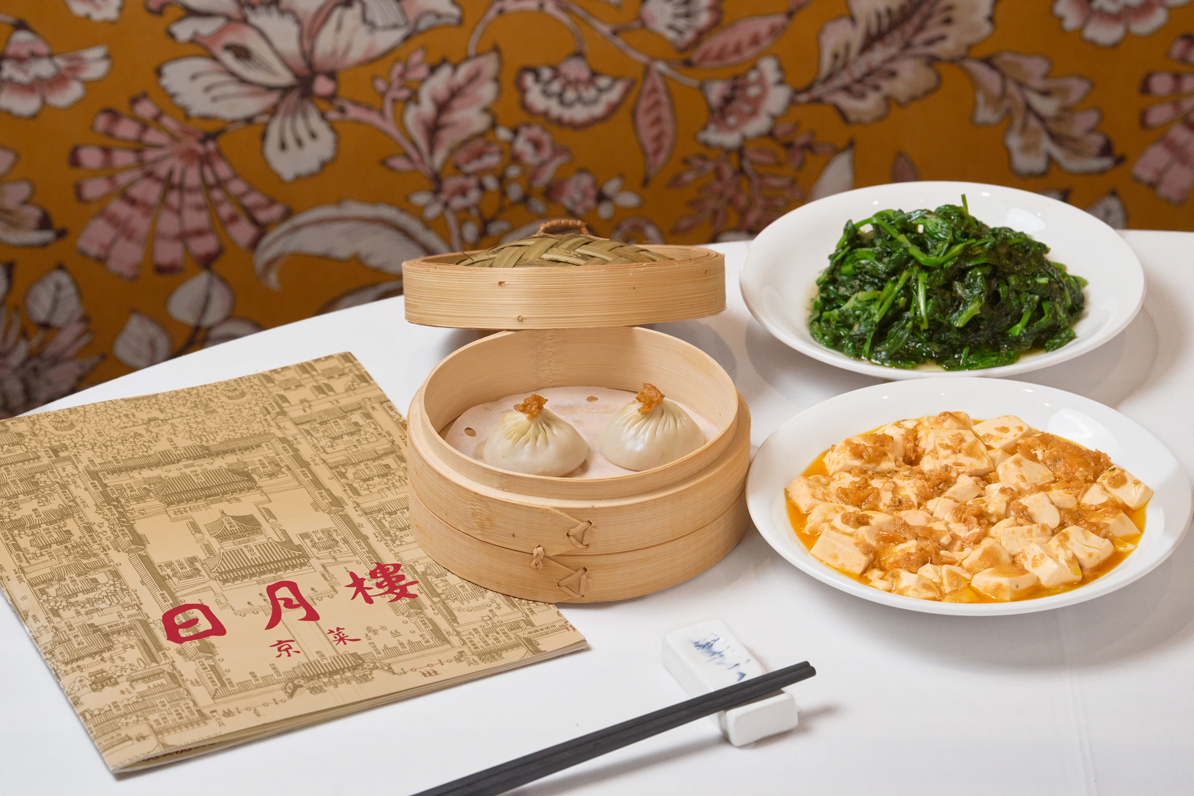
Dedicated to the rich, dynamic flavours of Peking cuisine, Sun Moon Place revives the familiar, remembered tastes of classic dishes and the vibrant dining culture of Hong Kong in the 1980s. Its brand creation centered on crafting a nostalgic identity that captures the style and spirit of a Peking restaurant, all while ensuring a warm and inviting atmosphere for everyday gatherings and culinary adventures.
The logo design of Sun Moon Place captures the essence of the traditional Chinese restaurants from the 80s in Hong Kong, reflecting its vibrant culture and culinary heritage. The typography uses bold and stylized Chinese characters for the restaurant's name, reminiscent of vintage signage. It has a dynamic flow that reflects traditional calligraphy. The logotype also incorporates English text in a retro font, balancing modern readability and vintage aesthetics. The warm red in the logo symbolizes prosperity and vitality in Chinese culture.
The two neon light signages evoke the lively atmosphere and bustling street life of '80s Hong Kong. These elements not only serve as a beacon for diners but also as an iconic representation of the restaurant's cultural roots. Its bright neon colour palette, such as vivid red and vibrant green, are reminiscent of classic neon signs from the '70s and '80s. Using a combination of steady and flickering lights to create an exciting and inviting gesture to both locals and tourists to experience the rich flavours of Peking cuisine.


